Astro UI 2026
Development.
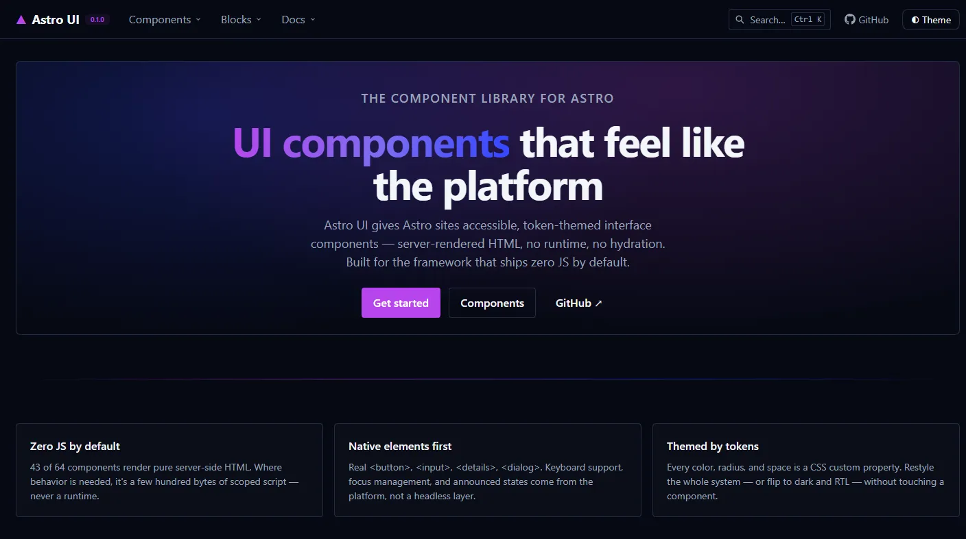
Astro UI is an open-source component library for Astro, published on npm as @parsakafi/astro-ui. It ships 64 accessible components that render to plain HTML, take their entire look from design tokens, and add no client-side runtime.
Why another component library
Astro’s promise is that a site ships JavaScript only where it needs it. Most component libraries are built for client-side frameworks, so using them in Astro means hydrating a runtime on pages that are mostly static HTML, or maintaining a copy-paste fork. Astro UI starts from the other end: every component is an .astro file that renders on the server, and JavaScript is a scoped exception for the few interactions the platform cannot handle alone, such as a dialog’s focus trap, a toast timer, or the carousel arrows.
The result is a library that feels native to Astro instead of grafted onto it: no hydration directives to forget, no client bundle to justify, and no component API that assumes a client-side application around it.
What’s inside
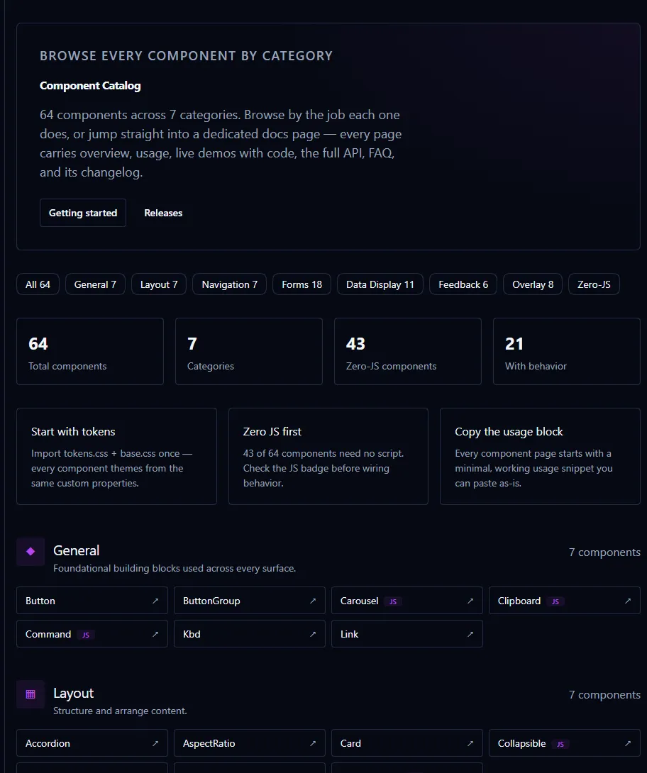
- 64 components across 7 categories, plus 25 composed blocks ready to copy.
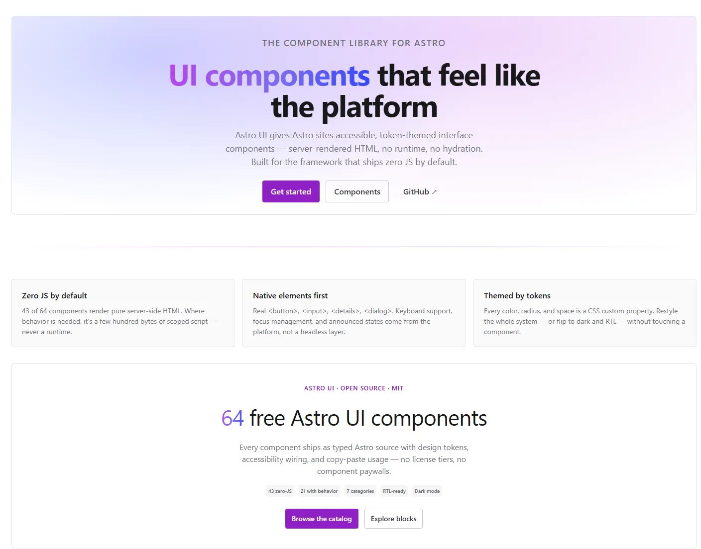
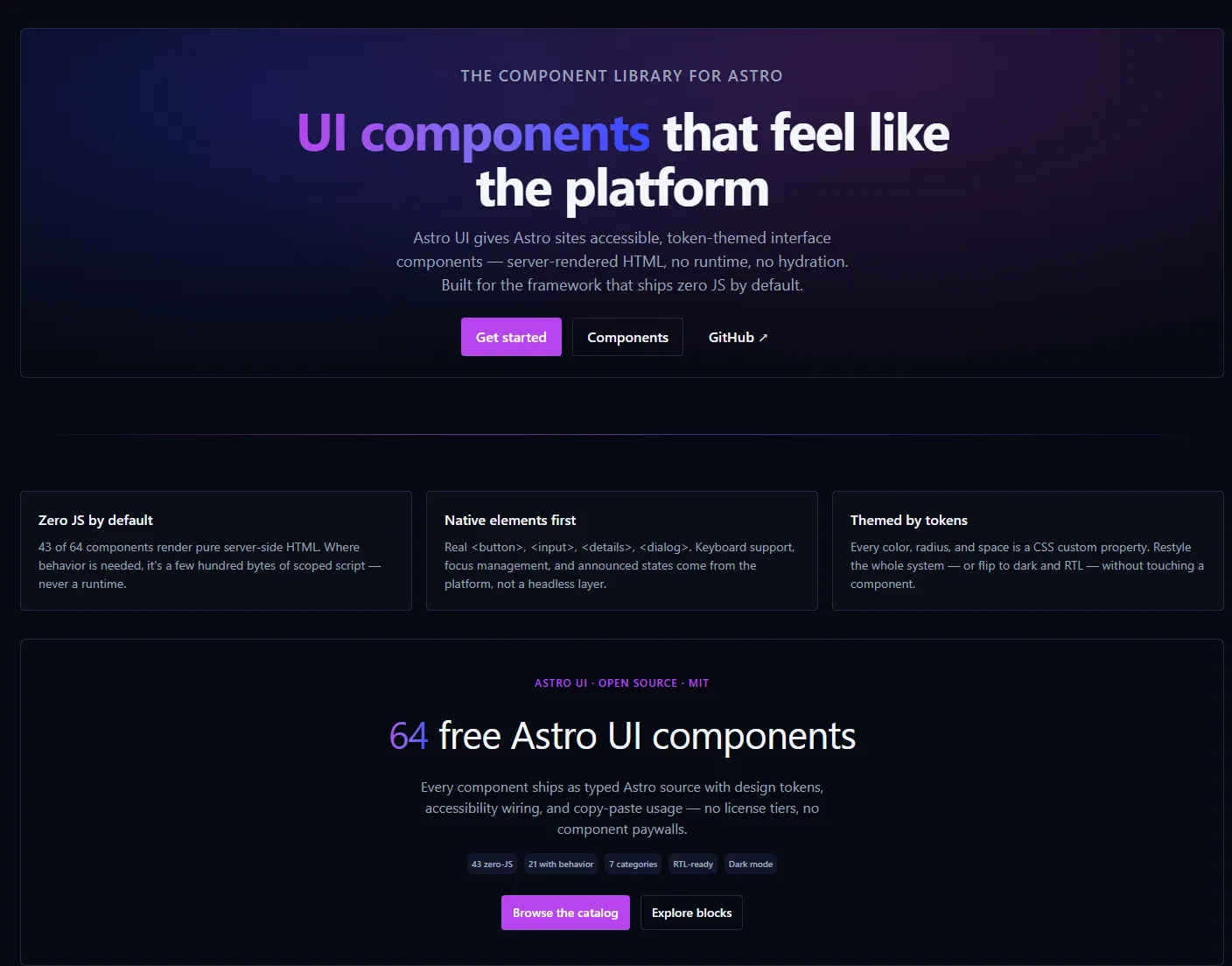
- 43 components render pure server-side HTML. The other 21 add a small scoped script, never a runtime.
- Typed and documented. Every component is an Astro file with a typed
propsinterface and JSDoc, soastro checkcatches misuse at build time. - Subpath exports.
@parsakafi/astro-ui/buttonimports one component; the root export imports the set. Both are tree-shakable by construction. - No runtime dependencies. The package ships Astro source and CSS, nothing else.
The catalog covers the seven categories you would expect from an application UI kit:
- General includes Button, ButtonGroup, Command, Carousel, Clipboard, Kbd, Link.
- Data display includes Badge, Avatar, Attachment, BeforeAfter, Table, Progress, Bubble, Chart, Empty, Tag, Timeline.
- Layout includes Card, AspectRatio, ScrollArea, Separator, Accordion, Collapsible, StickySurface.
- Feedback includes Alert, Spinner, Skeleton, Toast, Banner, NotificationCenter.
- Forms includes Autocomplete, Combobox, Field, Input, InputGroup, Label, Textarea, Select, Checkbox, Radio, Switch, Toggle, ToggleGroup, RadioGroup, Rating, Slider, DatePicker, TimePicker.
- Navigation includes Tabs, Breadcrumb, Pagination, Stepper, Tree, Navbar, Sidebar.
- Overlay includes Dialog, AlertDialog, Sheet, Tooltip, Popover, HoverCard, Lightbox, Menu.
Install
npm install @parsakafi/astro-uiImport the tokens once in your layout, then use the components:
---
import '@parsakafi/astro-ui/tokens.css'; // required. Semantic tokens and themes.
import '@parsakafi/astro-ui/base.css';   // optional. Focus rings, sr-only, reduced motion.
import { Button, Card } from '@parsakafi/astro-ui';
---

<Card>
    <Button variant="primary" size="lg">Get started</Button>
</Card>
Or import a single component when you want the tightest tree-shaking signal:
import Button from '@parsakafi/astro-ui/button';The package peers on Astro ^7.3.3.
Design decisions
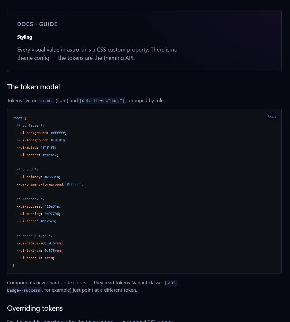
Tokens are the API
Every color, radius, space, and type size in a component resolves through a --ui-* custom property defined in tokens.css. There is no theme config object and there are no theme or colorScheme props. The contract tests reject those names. Restyling the whole system is a CSS override:
:root {
    --ui-primary: oklch(55% 0.2 290);
    --ui-radius-md: 0.375rem;
}
Theming is the same set of tokens under [data-theme="dark"]; leaving the attribute off follows the operating system. Component-private variables live under the --aui-* prefix, so internal styling can never collide with the public token surface.
Native elements first
The components wrap real platform elements: <button>, <input>, <details>, <dialog>, <hr>, <table>. Dialog, AlertDialog, and Sheet are built on <dialog> and inherit focus containment, Escape handling, and the backdrop. Accordion and Collapsible are <details> elements. Checkbox, Radio, and Switch are native inputs with a styled visual. Keyboard support, focus management, and announced state come from the browser instead of a headless UI layer.
Zero JS by default
Where the platform genuinely falls short, such as roving tabindex in Tabs, the WAI-ARIA menu-button model, the tree view, or the combobox filtering, the component ships a small scoped <script>. Contract tests fail the build on client:* directives, inline handlers, and unguarded browser globals, so the zero-JS claim is enforced rather than promised. Each documentation page states the JavaScript requirement of the component you are reading.
Accessibility as a gate
Semantic HTML comes first and ARIA is added only where semantics fall short. Focus is a :focus-visible outline driven by the ring tokens, prefers-reduced-motion is honored globally, token color pairs target WCAG AA, and data visualizations carry a screen-reader path. Components with keyboard behavior have Playwright interaction specs, and each docs page lists its roles, attributes, and keyboard model.
RTL without overrides
Layout uses logical properties, so direction is a document-level concern rather than a component one. Arrow keys follow the writing direction in the keyboard-navigable components, and the DatePicker renders Gregorian or Persian (Jalali) month grids using Intl.DateTimeFormat. No calendar library and no separate RTL build.
Documentation and blocks
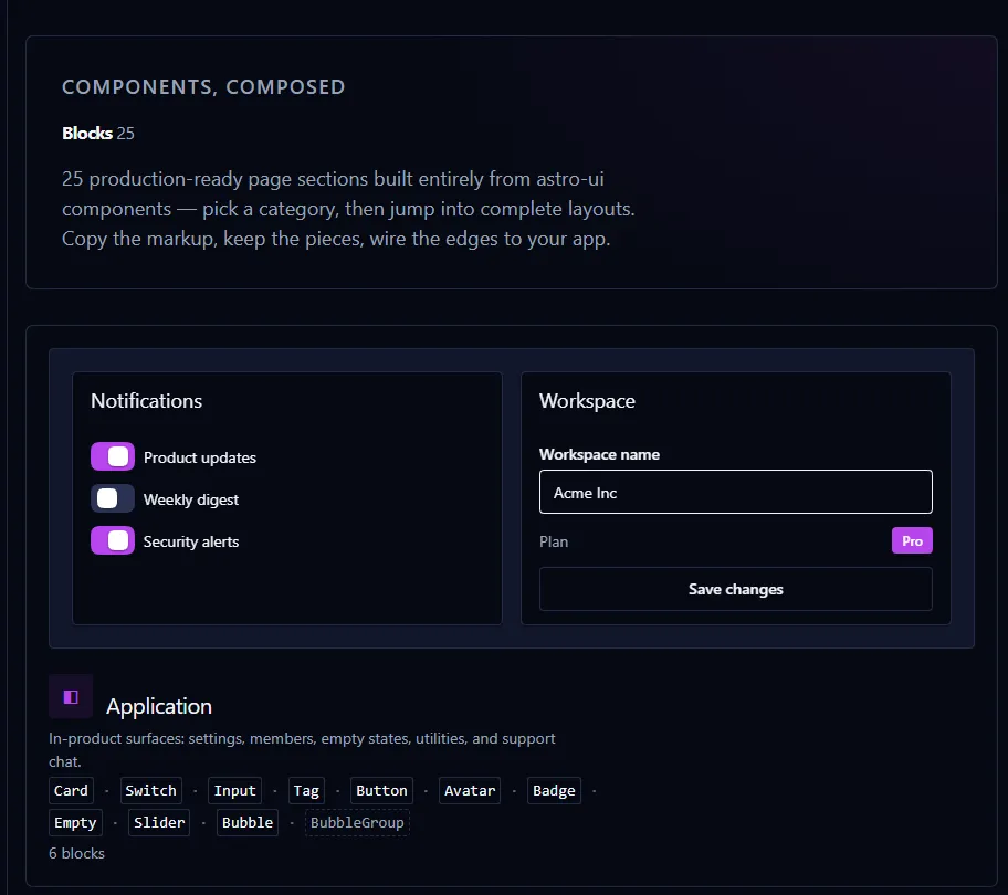
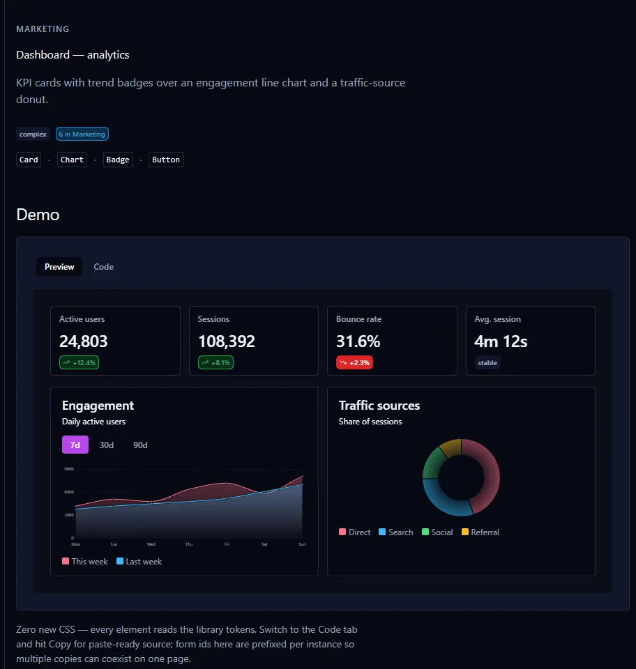
The docs live at astroui.ir and cover the parts you actually configure: installation, the token model, RTL, events, and Tailwind interop. Every component page carries an overview, usage, live demos with the matching code, the full props and slots tables, accessibility notes, and changelog. A token playground lets you edit --ui-* values live and copy the resulting CSS, and Ctrl + K searches the whole catalog. The 25 blocks, including auth screens, settings panels, pricing tiers, analytics dashboards, and FAQ sections, are built only from library components, so they can be copied and re-composed without bringing in another dependency.
Quality gates
The library is tested like a product, not a side project. astro check type-checks both the library and the docs site. Biome and ESLint run with zero warnings allowed. Vitest covers unit behavior and static component contracts: exports, token drift, prop vocabulary, SSR safety, and markup rules. Playwright covers the interactive components with role-based locators, and Chromium visual baselines compare light and dark rendering. prepublishOnly reruns the CSS build, the type check, lint, and the unit suite before anything reaches npm.
Light and dark, one token set
Project details
- Package is
@parsakafi/astro-ui. - Version is
0.1.0, the first public release. - License is MIT.
- Website is astroui.ir.
- Repository is github.com/parsakafi/astro-ui.
- Requirements are Astro
^7.3.3. - Contents are 64 components and 25 blocks across 7 categories.
The 0.1.0 version is deliberate: the API settles in public before the project commits to full SemVer stability, and the changelog tracks every change in the meantime.